Friday, 17 April 2015
Final Piece
This is my final piece, I have taken my final stage drafting and altered it slightly throughout the process to come up with this piece of work.
Wednesday, 15 April 2015
Work in Progress
I firstly started off by putting my drawings of the eyes into photoshop and editing the threshold. I then used the paintings that I had used and placed these under the eyes.
Next using the tea stained paper as a background, I lightened the background so it wasn't as harsh and set the page to portrait so that it was more like a poster.
I then followed the same process but with the drawing that I had done of the lips. I added in the colour and deleted any that leaked over the lips.
Next I adjusted the levels of the paintings so that it was more vibrant and then the hue to intensify the colour even more, as this was the desired effect that I was after.
I tried out a series of types for the title until I found this one. I placed it over the majority of the poster and then changed the colour to a vibrant blue. I then changed the blending mode to 'colour burn' which brightened up the colour and also made it more opaque so the eyes, lips and colour was more visible.
I then played around with the date and location and its whereabouts on the page. I tilted it and changed its position to get a feel for what looked best, and suited the rest of the poster,
Finally, I settled on placing it central because I feel that this looked best due to the whole title being centre aligned.
These are the different components that I drew/ painted and then put together to create my final piece.
Sunday, 29 March 2015
Colour Choices
I have taken my emulation and changed all the triangles so that they follow a particular colour scheme. I have done this because it has helped me get a feel of the sort of colours I could go for when choosing and designing my final piece.
The first one I designed is using monochromatic colours, I chose a red/ brown colour and used many different shades of it to fill the triangles.
The second one is using a triadic colour scheme. It is a basic red, blue and yellow scheme where the colours almost block each other out.
For the third, I have used a complementary colour scheme. I have used pinks, purples and blue because they're colours that go well, and I have simply altered the shade of these colours and filled in each triangle with a different one.
Finally, for the fourth one, I have used a full range of prismatic colours. This is my favourite one because it's overall more colourful and more eye-catching so it will suit my theme.
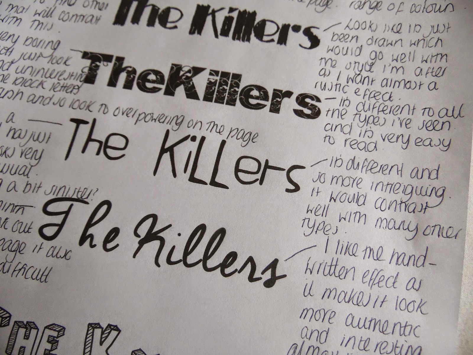
Digital Type
Drafting
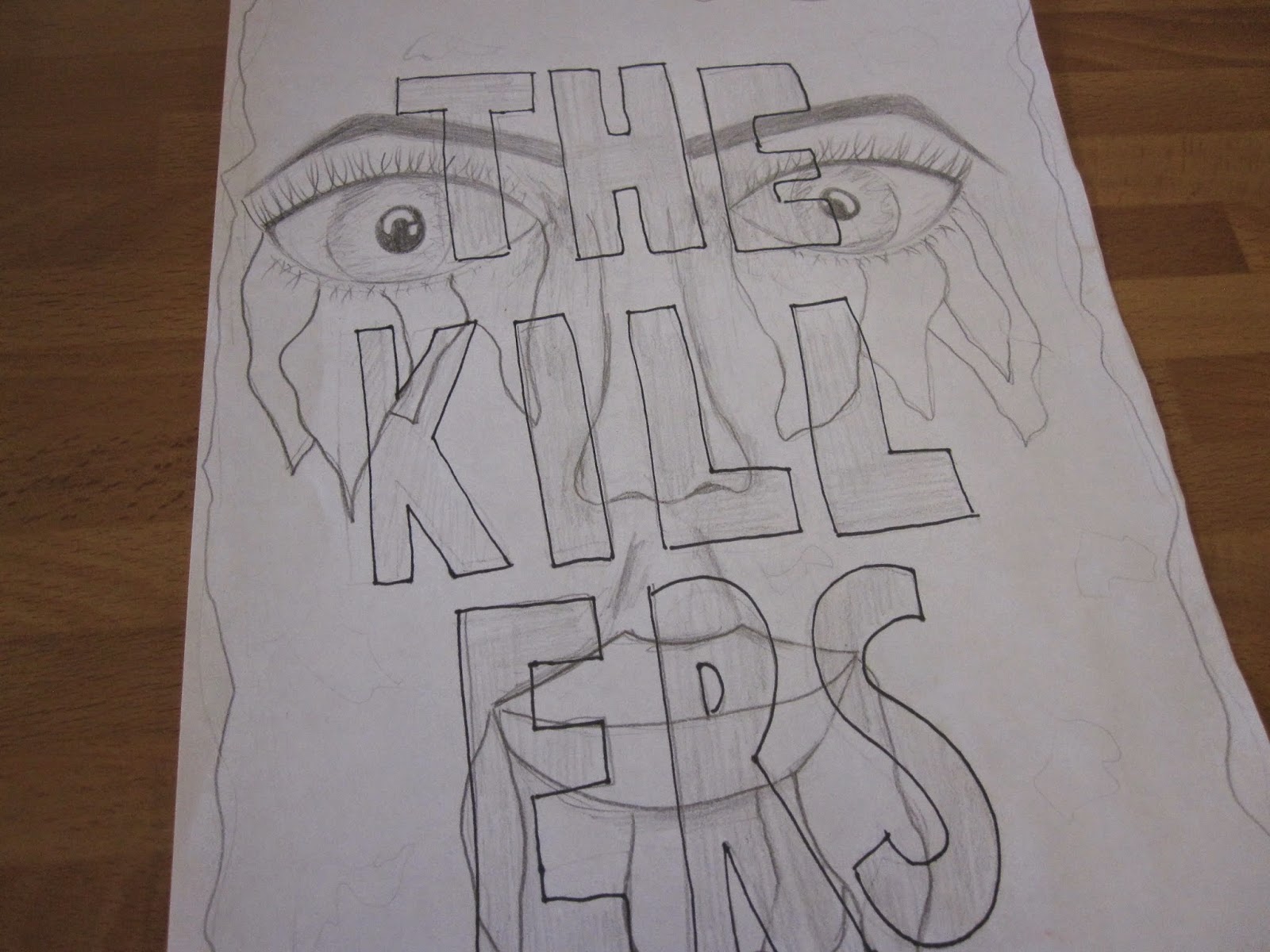
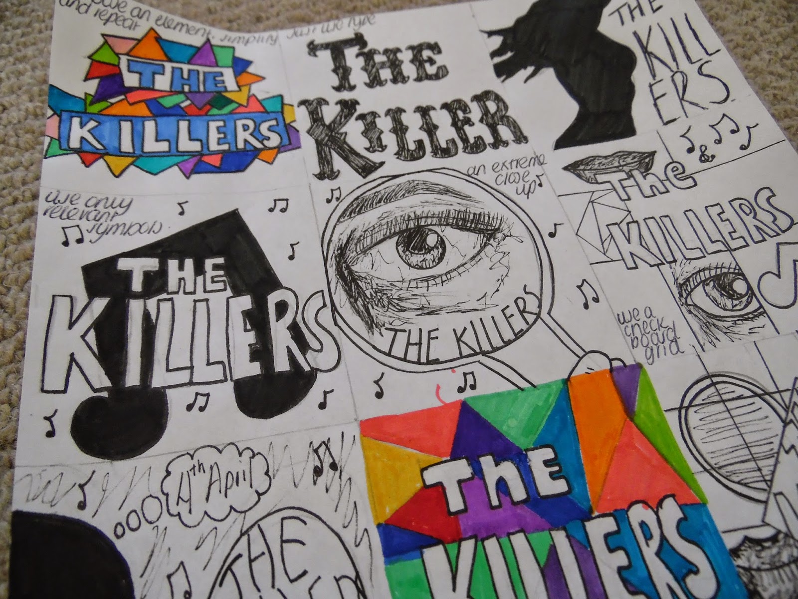
Here I have designed 12 different posters based around different themes. For example the top right is to use a silhouette so I have incorporated just that into my design. Also the middle drawing on the second row is an extreme close up. For this I chose to do an extreme close up on a face- specifically an eye because again this links back to my theme of eyes and lips.
Friday, 20 March 2015
Hand Drawn Type
These are all types that I have drawn myself and are what I like. I feel that some of them have potential to feature on my poster and so I will decide which ones I feel will suit it best.
Emulation
For my emulation, I took the style of the previous image and used it to inspire my own design. I took the bright colours from the original and used these but instead of swirls I changed my to triangles.
Thursday, 19 March 2015
Work in Progress

I started the process by drawing out the mans face using a fine liner. I drew all of the image apart from the colour that is used in his glasses and behind him. Then I scanned it into illustrator and created all the shadows on the face so that it looked as close to the original as possible. After doing this used watercolours to create the colourful shapes in the glasses. I had scanned this in and then took the illustrator work into photoshop to add the watercolour on top.
Subscribe to:
Comments (Atom)


.JPG)


.JPG)


